Building user-friendly ad experiences into your site and app isn’t easy, but if done right can lead to happier users and more control over your ad revenue.
To ensure you're providing good ad experiences, though, you'll want to lock down your responsive ad design strategy.
This article dives into what responsive ad design is and ideas for implementing it.
Please note: this assumes you have control over your ad platform code; if you are relying on third-party programmatic ad tags, then much of this responsiveness will be built into those scripts.
What is Responsive Ad Design?
To paraphrase Smashing Magazine's definition of 'responsive web design', responsive ad design refers to developing ad experiences that respond to a user's behavior and environment, based on device type, screen size, platform, and orientation.
Responsive ad design is a must for ensuring good ad experiences no matter how a user is viewing your content.
It can involve automatic resizing of ads, dynamic replacement of one ad for another, removal of the ad altogether, and so on, likely enabled through a mixture of CSS media queries, user agent string, and info you can pull via your mobile app.
Without a responsive ad strategy, you could be left with situations like below, where the ad doesn't dynamically adjust as the browser size is reduced, resulting in an ad experience neither the user nor the advertiser would be happy about (in this situation, the standard content is responsive, but not the ad).

First off, why is this important?
People will be consuming your content across a variety of devices (desktop, table, mobile) and within each of those you have various orientations, screen sizes, and resolutions.
If there’s not some level of responsiveness built into your product, then these issues could arise:
- Ads that are awkwardly cropped

- (The small browser size crops off part of the ad copy)
- Pixelated ads Trying to force a large ad into a small space (or vice versa) could lead to pixelated, obtrusive ads.
- Ads that are not optimized for the space they're in

- (The Atlantic is using the same 300x250 banner for mobile and tablet screen sizes, leaving an awkward white space when viewing from an iPad)
- Slow load times If you're using the same large, high-quality creative across high- and low-res screens, then you're bound to have slower ad load times on mobile.
In other words, without a responsive ad design strategy, you are bound to have poor ad experiences and broken ads. Optimizing your ad experiences will lead to less obtrusive ads and more engaging content.
How can I create responsive ad experiences?
There are a few ways to optimize your ads so they are properly formatted across various screen sizes.
1. Use the code you already have
This will be a common approach for native advertising units where the sponsored content is already supposed to look and act like organic content.
In this case, any responsive code built for the layout of the site/app can be transferred to the ads too.
For example, as noted in this video, the sponsored listing ad units on the eCommerce site Chairish have the same responsive behavior as the organic listings.
2. Use standard responsive code for static images
We won't get into how this works; there are many resources for how to make images responsive. It's predominately a method that uses CSS media queries and HTML, such as "max-width: 100%" to auto-scale, or "srcset" that contains multiple images based on screen size:
It's important you remember that (1) not all banner sizes can be resized automatically without issues and (2) inserting the same high-quality image for both desktop and mobile could lead to slow ad load times on mobile.

3. Include screen size as a targeting option within your ad decision engine
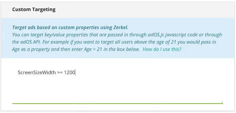
Here, you dynamically pull the screen size and send that in your ad request in, say, a "ScreenSizeWidth" parameter. Meanwhile, in your ad server you set up campaigns targeting specific "ScreenSizeWidth" values, such as "ScreenSizeWidth > 1200".
Then, when your ad decision engine is deciding what ad to display, it'll use the screen size parameter as a targeting metric. Campaigns targeting specific widths would be eligible only if the ad request contains a matching "ScreenSizeWidth" value.

For instance, you could set up your campaigns so that large, high-quality ads would appear only on large browsers, while the smaller, cropped ones would appear elsewhere.
The responsiveness, then, is not built into the web/mobile app's code; instead, it's the ad decision engine that's picking the right ad for the right screen size.
That said, some responsive CSS may still be needed, as desktop users may decide to shrink the browser, which wouldn't necessarily kick off a new ad request. One approach is to make multiple ad calls to the ad server for different ad sizes and store them in the HTML (like in "data-large" and "data-small" elements, or the aforementioned "srcset").
If the screen is resized, the browser will then switch to the right ad without a separate ad request.
4. Dynamic ads
Dynamic ads are ad units where the various properties - such as text, image, call-to-action, etc - exist as independent content pieces that can be organized in different ways based on screen size.
In other words, the creative isn’t a static image where the ad copy and CTA have to shrink accordingly (potentially becoming hard to read).
You can see dynamic ads in action on Smashing Magazine in this video. As the screen resizes in real-time, the button and ad copy get rearranged to accommodate the new layout.
Dynamic ads necessitate that you aren't working with static image files. Instead, there will be one (or multiple) text-free images, with the text/logos/etc moved around dynamically based on screen size.
Great - anything else to consider?
A good ad platform strikes the right balance between user experience and advertiser needs.
A sound ad responsiveness approach satisfies both: users get ad experiences that are tailored to their screen size and advertisers can ensure they aren’t paying for truncated or pixelated ads that could lead to low engagement rates.


